Lost in a sea of film? Let CinScope pick your next.
Role – UI Designer
Time – 2024
Expertises – User-friendly Interaction
Industry – Media Tech
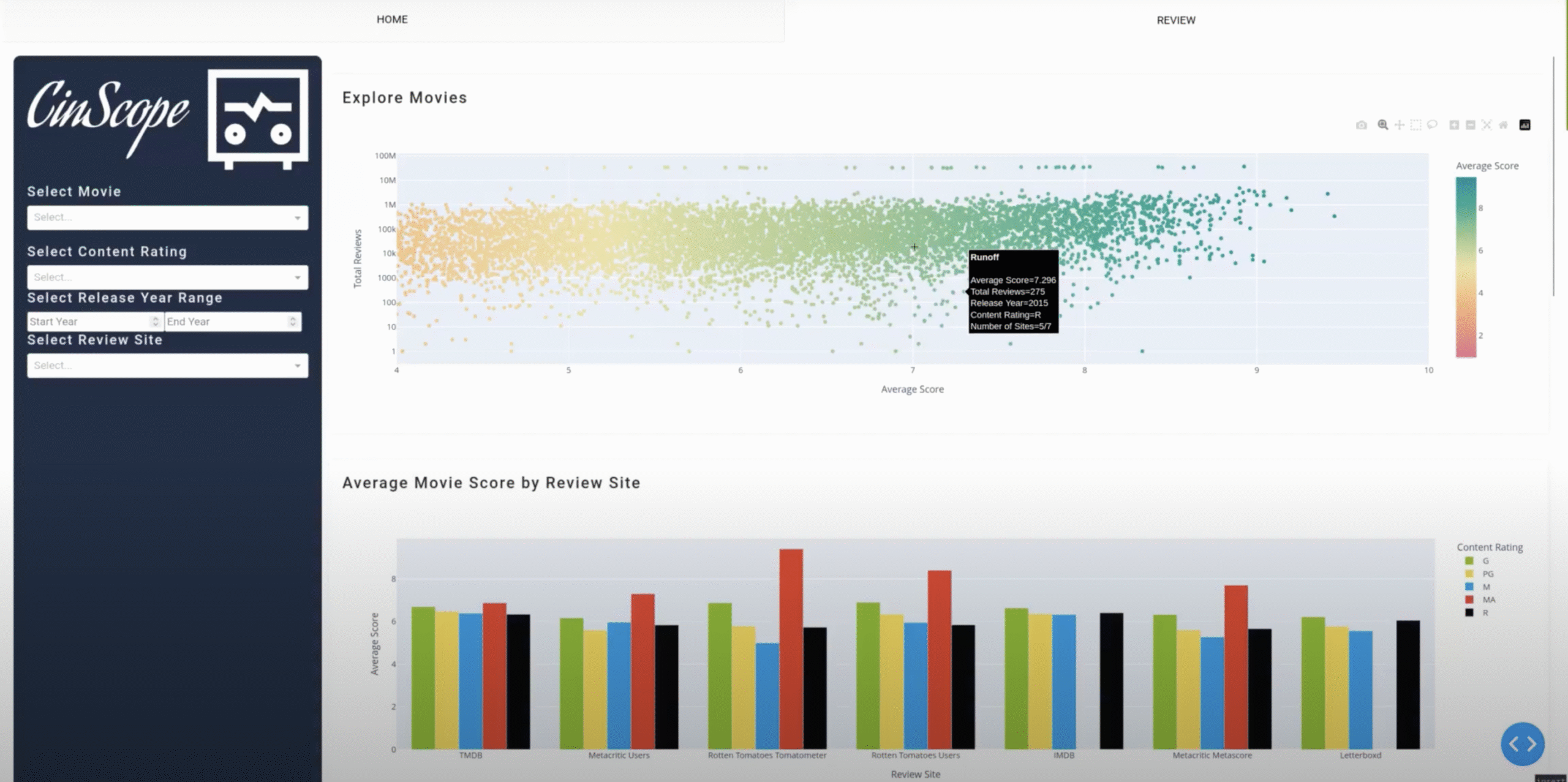
CinScope is a research-driven tool makes choosing your next film effortless. It unifies scattered ratings into a single and clear view. With customizable filters and an interactive dashboard, you explore data your way. Visual charts, clean comparison, and smart metrics turn complex reviews into confident choices. With CinScope, you’ll break the bias, choose with scope.
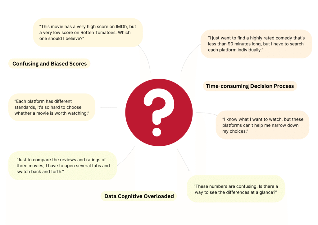
User pain points
How to Solve?
Techs
Development
PythonDash Framework
Database
DuckDBClick house BeautifulSoup4
Friendly UI
FigmaVisual FlowModular UI
Technical Integration for Reliable Context
"All ratings, one view."
CinScope consolidates ratings from review sites into a single and unified view, breaking down bias and underestimation. Makes you trust the numbers and pick your film without losing.
Adaptive Interface for Personalized Exploration
"Filter it your way."
With interactive filters and custom sorting built into the dashboard, you can shape data in your own way. Filter your way. Decide your pace.
Streamlined Flow for Faster Choices
"Decide in seconds."
CinScope translated multi-source rating data into clear charts and smart metrics, highlighting key trends at a glance. And it supports insights faster and accurately. So you can spot what matters, focusing on making the right choice, not just reading through the data.
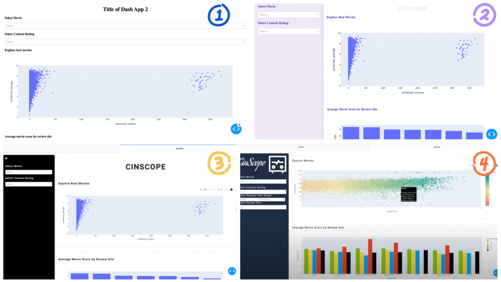
Design Process
Build a User-friendly Interface
Refined layout, guiding visual flow, modular UI structures, and color comparison in Figma to support users in quickly locating key data and making faster decisions without error.
How I Improve Better User Experience?
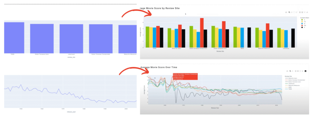
To reduce the friction in cross-platform data comparison, streamlining multiple rating into a single, readable chart, so users don’t need to jump between sources and charts.
Reflections
The main concept of CinScope is the usage and organized of big data. How the data is organized shapes its impact, so our team and I tried to explore the data in varied expressions. The data visualization is one of the useful and intuitive approaches and we wanted to solve the potential issues of big data, which are cognitive bias and decision error. Apparently, the outcome is positive but why visualized data solve the issues well? I have learned and explored some key insights from this experience.
Firstly, the graph helps brain address information in perception instead of reasoning, enhancing its understanding and memory. Secondly, the brain is particularly sensitive to trends, range, and outliers of clues. It leads users to identify specific highlights that cannot be quickly perceived through reading text. Lastly, contextual indicators establish user confidence in the bigger picture.
To conclude, I believe data visualization is a good way to effectively enhance data persuasiveness, especially when we find key values by addressing big data with our brains rather than computers. For me, CinScope is a good start to the data world.